
%20--%3e%3csvg%20version='1.1'%20id='Layer_1'%20xmlns='http://www.w3.org/2000/svg'%20xmlns:xlink='http://www.w3.org/1999/xlink'%20x='0px'%20y='0px'%20viewBox='0%200%2042%2042'%20style='enable-background:new%200%200%2042%2042;'%20xml:space='preserve'%3e%3cstyle%20type='text/css'%3e%20.st0{fill:%23FAF4EB;}%20.st1{fill:none;}%20.st2{fill:%2307161C;}%20.st3{fill:none;stroke:%23000000;stroke-width:3;}%20%3c/style%3e%3ccircle%20class='st0'%20cx='21.1'%20cy='21.2'%20r='20.4'/%3e%3cpath%20class='st1'%20d='M21,0c11.6,0,21,9.4,21,21s-9.4,21-21,21S0,32.6,0,21S9.4,0,21,0z'/%3e%3cpath%20class='st2'%20d='M21,1C10,1,1,9.9,1,21c0,2.7,0.5,5.3,1.6,7.8C5.7,36.2,13,41,21,41c11,0,20-8.9,20-20c0-2.7-0.5-5.3-1.6-7.8%20C36.3,5.8,29,1,21,1%20M21,0c11.6,0,21,9.4,21,21s-9.4,21-21,21S0,32.6,0,21S9.4,0,21,0z'/%3e%3cpath%20class='st3'%20d='M31.4,21H9.8'/%3e%3cpath%20class='st3'%20d='M17.2,13.6L9.8,21l7.4,7.4'/%3e%3c/svg%3e)
Warburtons
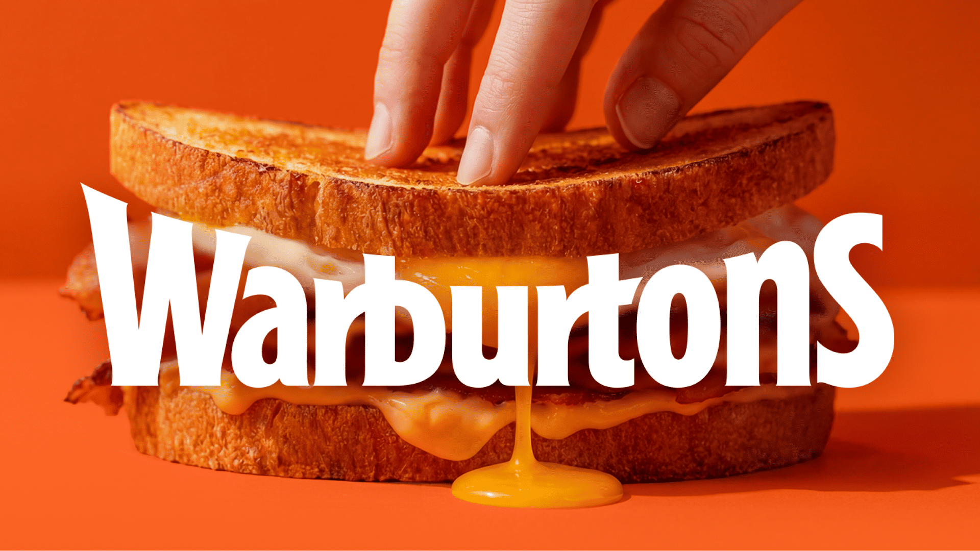
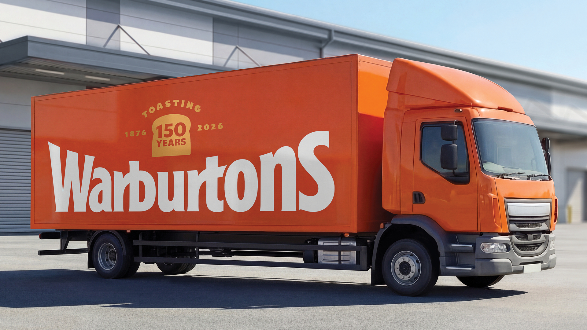
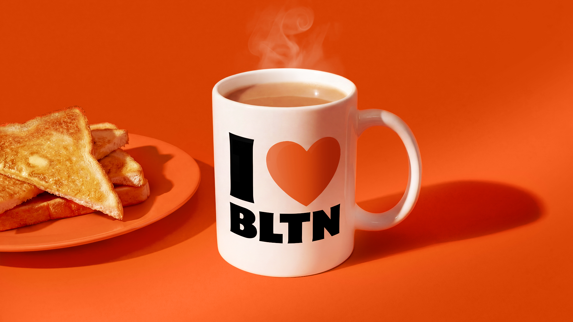
Warburtons is Britain’s most chosen FMCG brand, with more than 70 products across multiple categories. Working closely with the Warburtons team, we brought the unmistakable presence of Warburtons iconic orange lorries straight to shelf.
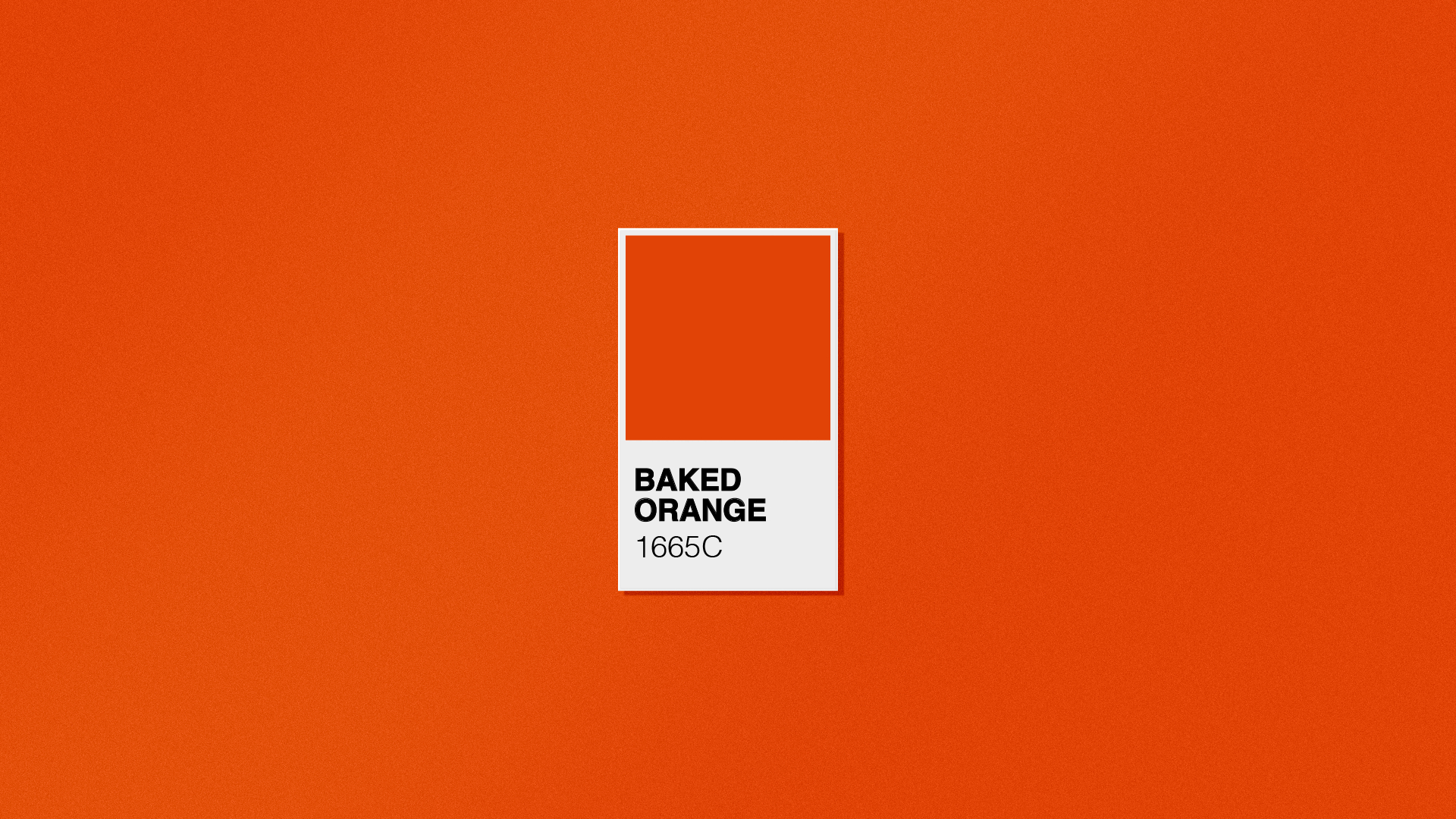
At the heart of the system is a ownable pack architecture built around the Warburtons ‘smile’. Inspired by the iconic curve of the wordmark, it becomes a unifying device across the portfolio — anchoring every pack in a confident hit of Baked Orange and amplifying the brand’s most recognisable asset at shelf.
The result is instant recognition wherever Warburtons appears in store, across aisles, formats and categories, turning portfolio scale into a powerful branding advantage.
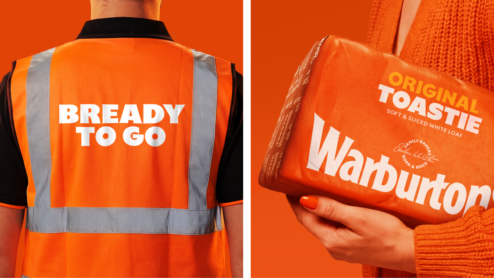
To bring even greater unity to the portfolio, we partnered with Studio Drama to create a bespoke typeface inspired by the memorable shapes and details of the Warburtons wordmark. Characterful yet consistent, it gives the system a single visual voice while allowing individual products to express their own personality.

Finally, we crafted a family roundel featuring Jonathan Warburton’s signature — a small but meaningful mark celebrating the family behind the loaves, bringing warmth, heritage and pride to the design.
Warburtons now operates under a single, coherent portfolio system — a brand-first foundation designed to make the range easier to shop today and ready to support growth for the next 150 years.
This ambitious packaging redesign not only solidifies Warburtons market leadership but also sets a new standard for brand consistency and consumer clarity in the bakery aisle.”
Chloe Cordover, Dieline
Taxi Studio has helped us create a clearer, more consistent presence in store, while making our range easier to shop. Importantly, it gives us a future-ready system that supports innovation and sets us up for continued growth.”
Katie White
Head of Product Marketing, Warburtons


%20--%3e%3csvg%20version='1.1'%20id='Layer_1'%20xmlns='http://www.w3.org/2000/svg'%20xmlns:xlink='http://www.w3.org/1999/xlink'%20x='0px'%20y='0px'%20viewBox='0%200%201220%20255'%20style='enable-background:new%200%200%201220%20255;'%20xml:space='preserve'%3e%3cstyle%20type='text/css'%3e%20.st0{fill:%23FAF4EB;}%20%3c/style%3e%3cpath%20class='st0'%20d='M243.7,250.7h42.9l34-63.6l34.3,63.6h43l-55.6-99.8l51.3-93.1h-42.4l-30.6,56.2l-30.2-56.2h-43l51.9,93.1%20L243.7,250.7z'/%3e%3cpath%20class='st0'%20d='M446.4,0.8h-39v42.4h39V0.8z'/%3e%3cpath%20class='st0'%20d='M446.4,57.8h-39v192.9h39V57.8z'/%3e%3cpath%20class='st0'%20d='M98.5,218.5c-13.4,2.2-22.7,1-28.2-3.6c-4.5-3.8-6.7-10.9-6.7-19.4L63.2,88.3h35V57.8h-35l0.5-56.9H25.8%20l-0.5,56.9l-25.1,0v30.5h23.9c0,0,0.5,79.5,0.5,116.2c0,16.7,4.7,29.1,13.9,37.1c12.1,10.4,31.8,13.4,60.1,9.2L98.5,218.5z'/%3e%3cpath%20class='st0'%20d='M595,88.3h23.9c0,0,0.5,79.5,0.5,116.2c0,16.7,4.7,29.1,13.9,37.1c12.1,10.4,31.8,13.4,60.1,9.2%20c0-6.8,0-27.3,0-32.2c-13.4,2.2-22.7,1-28.2-3.6c-4.5-3.8-6.7-10.9-6.7-19.4l-0.5-107.2h35V57.8h-35l0.5-57h-37.8l-0.5,56.9H595%20L595,88.3z'/%3e%3cpath%20class='st0'%20d='M1080.1,184.9c0,37.7,29.7,69.7,69.8,69.7c39.7,0,69.6-32.3,69.6-69.7c0-3.9,0.2-37.8,0.2-59.1%20c0-37.7-29.7-69.7-69.8-69.7c-39.7,0-69.6,32.3-69.6,69.7C1080.3,129.7,1080.1,163.6,1080.1,184.9z%20M1121.1,118.5%20c0-13.9,9.5-31.9,29-31.9c19.7,0,28.8,17.9,28.8,31.9c0,2.7,0.2,72.9,0.2,72.9c0,14.8-9.5,32.8-29.5,32.8c-19.7,0-28.5-18.1-28.5-32%20V118.5z'/%3e%3cpath%20class='st0'%20d='M465.2,183.3V196c0,23.4,20,56.4,64.4,56.4c37.5,0,64.7-22.7,64.7-54c0-24.8-8.6-44.4-50.5-59.5l-4.2-1.5%20c-22.6-8.1-35.1-12.5-35.1-30.5c0-12.3,10-20.9,24.4-20.9c7.2,0,23.9,2.6,23.9,27.2v4.6h36.7v-4.2c0-34.4-24.1-57.4-59.9-57.4%20c-34.5,0-61.6,22.8-61.6,51.8c0,29.5,16.2,47.1,54.2,58.8c20.7,6.4,33.5,13.9,33.5,31.6c0,22.4-18.6,24.2-24.3,24.2%20c-20.8,0-28.4-20.4-28.4-34.1v-5.1L465.2,183.3z'/%3e%3cpath%20class='st0'%20d='M922.7,56.3c-36.1,0-58.5,26.5-58.5,69.1c0,18.9,0,28,0,36c0,6.4,0,12.1,0,21.5c0,51.2,30.2,69.5,58.4,69.5%20c20.2,0,34.1-15.2,37-20.8l0.6-1.2l7.8,20.3h29.8V0.8h-38.9v75.5l-1.2-1.9C955.2,70.1,945.2,56.3,922.7,56.3%20M932.2,222.7%20c-16.5,0-29-13.1-29.1-30.6c0-2.8,0-75.5,0-75.5c0-18.8,15-30.5,28.9-30.5c16.7,0.1,25.7,14.2,26.9,27.3v81.9%20C958.9,206.7,948.8,222.7,932.2,222.7L932.2,222.7z'/%3e%3cpath%20class='st0'%20d='M749.1,57.8h-39.3v124.8c0,33.8,15.5,69.8,58.8,69.8c21.7,0,34.9-16.7,37-20.8l0.6-1.2l7.8,20.3h30V57.8h-39.1%20v137.4c0,6.7-3.4,14.5-8.8,19.8c-2.3,2.4-5.1,4.3-8.2,5.6c-3.1,1.3-6.4,2-9.7,2h-0.1c-16.7-0.1-29.2-13.2-29.2-30.6L749.1,57.8z'/%3e%3cpath%20class='st0'%20d='M179.1,86.3c11.6,0,19.5,7.2,19.5,18c0,17.3-20.4,25.7-32.7,30.8c-1.9,0.8-8.1,3.5-9.8,4.3%20c-18.1,7.9-48.4,21.2-48.4,57.6c0,34.8,19.7,55.5,52.8,55.5c27,0,39-22.1,39-22.1l7.9,20.3h29.9l0.1-142.2%20c0-33.2-21.6-52.3-59.2-52.3c-37.3,0-64.3,24.3-64.3,57.7v4.2c13.6,0,34.2,0,38.1,0v-3.5C151.9,100.9,159,86.3,179.1,86.3z%20M170.3,222.6c-15.6,0-24.9-8.9-24.9-23.9c0-18.1,16.5-26.9,31.1-34.6c8.4-4.4,16.3-8.6,20.9-14.2l1.1-1.4V189%20C198.4,210.1,187.9,222.6,170.3,222.6'/%3e%3cpath%20class='st0'%20d='M1060.5,0.8h-39v42.4h39V0.8z'/%3e%3cpath%20class='st0'%20d='M1060.5,57.8h-39.1v192.9h39.1V57.8z'/%3e%3c/svg%3e)