
Impact
%20--%3e%3csvg%20version='1.1'%20id='Layer_1'%20xmlns='http://www.w3.org/2000/svg'%20xmlns:xlink='http://www.w3.org/1999/xlink'%20x='0px'%20y='0px'%20viewBox='0%200%2042%2042'%20style='enable-background:new%200%200%2042%2042;'%20xml:space='preserve'%3e%3cstyle%20type='text/css'%3e%20.st0{fill:%23FAF4EB;}%20.st1{fill:none;}%20.st2{fill:%2307161C;}%20.st3{fill:none;stroke:%23000000;stroke-width:3;}%20%3c/style%3e%3ccircle%20class='st0'%20cx='21.1'%20cy='21.2'%20r='20.4'/%3e%3cpath%20class='st1'%20d='M21,0c11.6,0,21,9.4,21,21s-9.4,21-21,21S0,32.6,0,21S9.4,0,21,0z'/%3e%3cpath%20class='st2'%20d='M21,1C10,1,1,9.9,1,21c0,2.7,0.5,5.3,1.6,7.8C5.7,36.2,13,41,21,41c11,0,20-8.9,20-20c0-2.7-0.5-5.3-1.6-7.8%20C36.3,5.8,29,1,21,1%20M21,0c11.6,0,21,9.4,21,21s-9.4,21-21,21S0,32.6,0,21S9.4,0,21,0z'/%3e%3cpath%20class='st3'%20d='M31.4,21H9.8'/%3e%3cpath%20class='st3'%20d='M17.2,13.6L9.8,21l7.4,7.4'/%3e%3c/svg%3e)
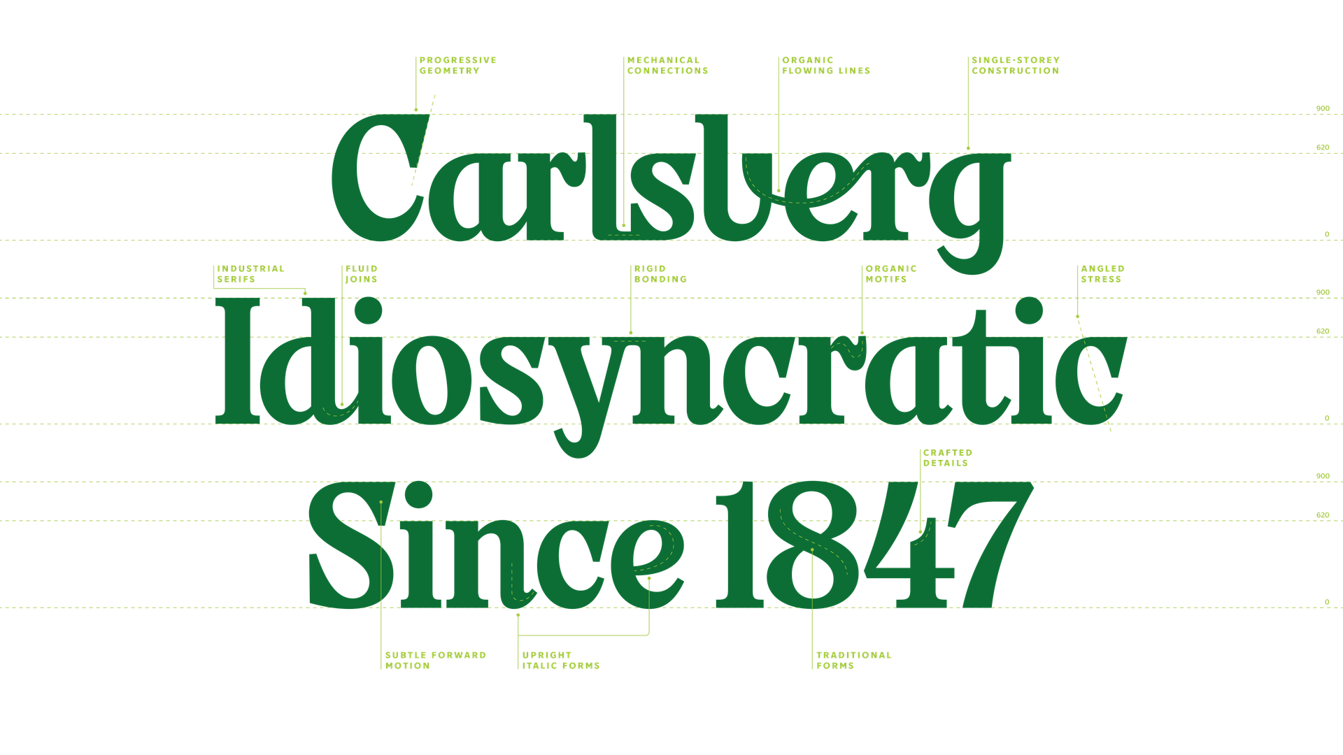
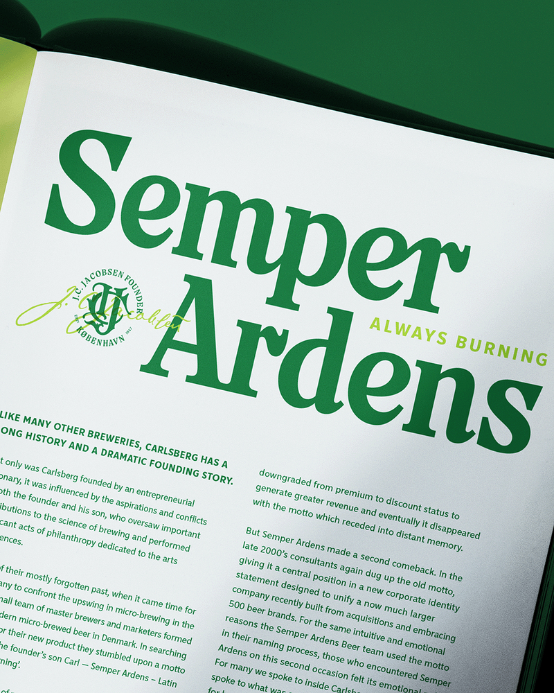
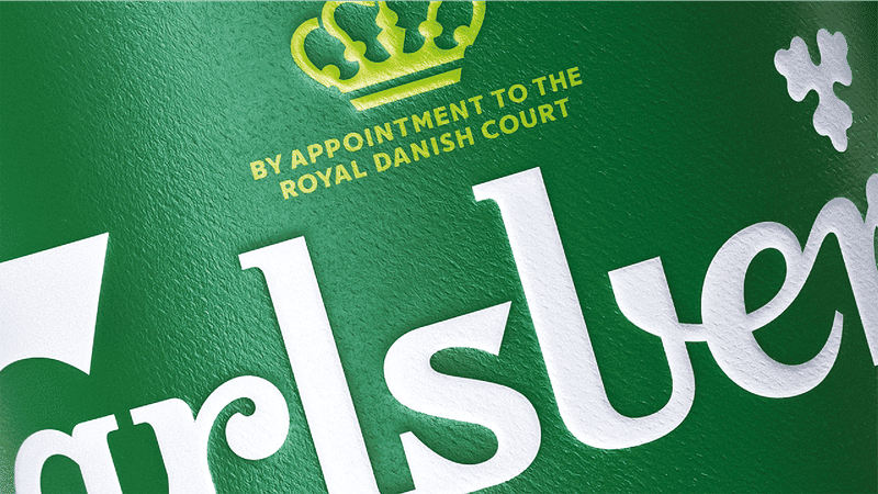
Carlsberg: Probably Serif
We partnered with Carlsberg to create Probably Serif — a bespoke typeface inspired by the iconic 1904 wordmark designed by Danish Art Nouveau pioneer Thorvald Bindesbøll. Drawing from the original mark’s distinctive curves, angled cuts and expressive ligatures, the typeface transforms Carlsberg’s unique visual heritage into a contemporary brand asset.
Developed across both Latin and Cyrillic scripts, it combines character with versatility, giving the brand a distinctive typographic system that works consistently across every market, channel and touchpoint.
The challenge was as much commercial as it was creative. As advertising regulations increasingly restrict the use of logos, packaging and other brand assets, Carlsberg needed a new way to remain recognisable. Probably Serif was designed to carry the brand independently — creating immediate recognition even when traditional brand cues cannot be used.
More than a typeface, Probably Serif has become a distinctive asset for one of the world’s most iconic beer brands. It gives Carlsberg a unified global voice, strengthens recognition, supports premium positioning and helps protect long-term brand recognition in an increasingly restricted communications landscape. By transforming a celebrated piece of brand heritage into a scalable global system, Carlsberg has created a powerful new way to remain unmistakably Carlsberg wherever consumers encounter the brand.


%20--%3e%3csvg%20version='1.1'%20id='Layer_1'%20xmlns='http://www.w3.org/2000/svg'%20xmlns:xlink='http://www.w3.org/1999/xlink'%20x='0px'%20y='0px'%20viewBox='0%200%201220%20255'%20style='enable-background:new%200%200%201220%20255;'%20xml:space='preserve'%3e%3cstyle%20type='text/css'%3e%20.st0{fill:%23FAF4EB;}%20%3c/style%3e%3cpath%20class='st0'%20d='M243.7,250.7h42.9l34-63.6l34.3,63.6h43l-55.6-99.8l51.3-93.1h-42.4l-30.6,56.2l-30.2-56.2h-43l51.9,93.1%20L243.7,250.7z'/%3e%3cpath%20class='st0'%20d='M446.4,0.8h-39v42.4h39V0.8z'/%3e%3cpath%20class='st0'%20d='M446.4,57.8h-39v192.9h39V57.8z'/%3e%3cpath%20class='st0'%20d='M98.5,218.5c-13.4,2.2-22.7,1-28.2-3.6c-4.5-3.8-6.7-10.9-6.7-19.4L63.2,88.3h35V57.8h-35l0.5-56.9H25.8%20l-0.5,56.9l-25.1,0v30.5h23.9c0,0,0.5,79.5,0.5,116.2c0,16.7,4.7,29.1,13.9,37.1c12.1,10.4,31.8,13.4,60.1,9.2L98.5,218.5z'/%3e%3cpath%20class='st0'%20d='M595,88.3h23.9c0,0,0.5,79.5,0.5,116.2c0,16.7,4.7,29.1,13.9,37.1c12.1,10.4,31.8,13.4,60.1,9.2%20c0-6.8,0-27.3,0-32.2c-13.4,2.2-22.7,1-28.2-3.6c-4.5-3.8-6.7-10.9-6.7-19.4l-0.5-107.2h35V57.8h-35l0.5-57h-37.8l-0.5,56.9H595%20L595,88.3z'/%3e%3cpath%20class='st0'%20d='M1080.1,184.9c0,37.7,29.7,69.7,69.8,69.7c39.7,0,69.6-32.3,69.6-69.7c0-3.9,0.2-37.8,0.2-59.1%20c0-37.7-29.7-69.7-69.8-69.7c-39.7,0-69.6,32.3-69.6,69.7C1080.3,129.7,1080.1,163.6,1080.1,184.9z%20M1121.1,118.5%20c0-13.9,9.5-31.9,29-31.9c19.7,0,28.8,17.9,28.8,31.9c0,2.7,0.2,72.9,0.2,72.9c0,14.8-9.5,32.8-29.5,32.8c-19.7,0-28.5-18.1-28.5-32%20V118.5z'/%3e%3cpath%20class='st0'%20d='M465.2,183.3V196c0,23.4,20,56.4,64.4,56.4c37.5,0,64.7-22.7,64.7-54c0-24.8-8.6-44.4-50.5-59.5l-4.2-1.5%20c-22.6-8.1-35.1-12.5-35.1-30.5c0-12.3,10-20.9,24.4-20.9c7.2,0,23.9,2.6,23.9,27.2v4.6h36.7v-4.2c0-34.4-24.1-57.4-59.9-57.4%20c-34.5,0-61.6,22.8-61.6,51.8c0,29.5,16.2,47.1,54.2,58.8c20.7,6.4,33.5,13.9,33.5,31.6c0,22.4-18.6,24.2-24.3,24.2%20c-20.8,0-28.4-20.4-28.4-34.1v-5.1L465.2,183.3z'/%3e%3cpath%20class='st0'%20d='M922.7,56.3c-36.1,0-58.5,26.5-58.5,69.1c0,18.9,0,28,0,36c0,6.4,0,12.1,0,21.5c0,51.2,30.2,69.5,58.4,69.5%20c20.2,0,34.1-15.2,37-20.8l0.6-1.2l7.8,20.3h29.8V0.8h-38.9v75.5l-1.2-1.9C955.2,70.1,945.2,56.3,922.7,56.3%20M932.2,222.7%20c-16.5,0-29-13.1-29.1-30.6c0-2.8,0-75.5,0-75.5c0-18.8,15-30.5,28.9-30.5c16.7,0.1,25.7,14.2,26.9,27.3v81.9%20C958.9,206.7,948.8,222.7,932.2,222.7L932.2,222.7z'/%3e%3cpath%20class='st0'%20d='M749.1,57.8h-39.3v124.8c0,33.8,15.5,69.8,58.8,69.8c21.7,0,34.9-16.7,37-20.8l0.6-1.2l7.8,20.3h30V57.8h-39.1%20v137.4c0,6.7-3.4,14.5-8.8,19.8c-2.3,2.4-5.1,4.3-8.2,5.6c-3.1,1.3-6.4,2-9.7,2h-0.1c-16.7-0.1-29.2-13.2-29.2-30.6L749.1,57.8z'/%3e%3cpath%20class='st0'%20d='M179.1,86.3c11.6,0,19.5,7.2,19.5,18c0,17.3-20.4,25.7-32.7,30.8c-1.9,0.8-8.1,3.5-9.8,4.3%20c-18.1,7.9-48.4,21.2-48.4,57.6c0,34.8,19.7,55.5,52.8,55.5c27,0,39-22.1,39-22.1l7.9,20.3h29.9l0.1-142.2%20c0-33.2-21.6-52.3-59.2-52.3c-37.3,0-64.3,24.3-64.3,57.7v4.2c13.6,0,34.2,0,38.1,0v-3.5C151.9,100.9,159,86.3,179.1,86.3z%20M170.3,222.6c-15.6,0-24.9-8.9-24.9-23.9c0-18.1,16.5-26.9,31.1-34.6c8.4-4.4,16.3-8.6,20.9-14.2l1.1-1.4V189%20C198.4,210.1,187.9,222.6,170.3,222.6'/%3e%3cpath%20class='st0'%20d='M1060.5,0.8h-39v42.4h39V0.8z'/%3e%3cpath%20class='st0'%20d='M1060.5,57.8h-39.1v192.9h39.1V57.8z'/%3e%3c/svg%3e)